TLDR; If your website still does it’s job, just do a refresh. If your website has become stagnant for a long time, consider a redesign.
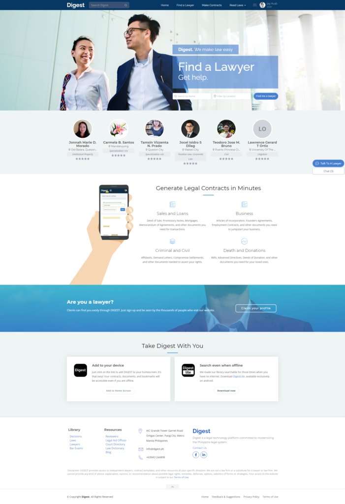
I’m going to cite one of our projects Digest.ph as an example throughout the article. Over a month ago, I was tempted to do a full revamp of our design in order to best accommodate recommendations from Works of Heart (WOH; design and branding experts; one of our mentors from AIM-DBI). But given Digest’s limited time and resources, the best decision was to go for a refresh (more on this below).
Struggles of a start-up website
WOH audited the website and among the comments were to make the copy more bespoke and buttons snappy. They want us to tailor fit the homepage for a specific type of customer. All suggestions were geared towards marketing and making the website convert.
With fresh eyes and their comments in mind, I proceeded to revisit our site and found that they were right – it was bad, LOL. Our homepage was uninspired and unorganized, the color palette has 50 shades of blue and the copy didn’t give clear call to action. People were showed a lot of information without any clear direction where to go.

Digest pivoted three times since the project started, more features were added as the business model got finalized. The homepage UI took a back seat and functionality became the priority. Having no full time graphic artist didn’t help either (though I double as the graphic artist when needed), it became visible that our assets were not coordinated.
I recommended to improve the UI and logo while the company finalizes its branding strategy. But it was a though decision for the company because the priority was on product development… not necessarily on marketing or making the site convert yet.
Breakthrough: Going back to the old prototype.
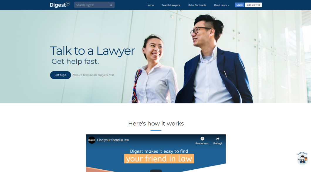
Luckily I was able to remember my original prototype from a year ago, it already had all the pieces that we needed for a quick refresh. I just had to integrate our primary product and the new logo. If you look at the finished homepage it may look like we did a redesign but since we just brought back some elements from the prototype I will consider it a refresh (borderline redesign :D). Anyway, the new graphical assets were quick adjustments.

This time I wanted to answer the 5 W’s and 1 H of our users. The intro section answers ‘what’ the website is all about and “where” to go to continue (See the “Talk to a Lawyer” heading and the “Let’s go” button). The second section explains ‘how’ it works (See the video explainer). The third section answers ‘why’ users would want to use Digest’s services. The fourth section shows ‘who’ the lawyers are. And finally, the fifth section answers ‘when’ to talk with lawyers (See the “Ok find me a lawyer now” call to action button).
When to do a refresh vs redesign
A refresh is pretty much like trying a new paint in your house. Do it if you want a quick way of highlighting new changes to your business.
- If there’s a new company logo, you may want your color palette and typefaces to match it.
- If there’s a new primary product, you should adjust your promotional content, replace outdated copy, set new call to actions and do on page SEO.
- When you want to improve user experience, you have to guide users to go where you want them to go. This may involve updating the navigation, search filters, modal windows and other combination of elements.
A redesign on the other hand is like a home renovation. It’s like starting from scratch while considering all features already on the site.
- If your website looks dated and content has been stagnant for years, if it doesn’t have a friendly user experience, takes too long to load, it’s your cue to do a redesign.
- If the company underwent a rebrand, you may want to keep your media assets, typefaces, colors, UX and copy current to reflect the new brand personality.
- If the website doesn’t use current tech that increases your site’s probability to convert (Ex. Responsiveness, PWA etc..)
- If you want to integrate marketing technology to track and analyze product performance (Ex. Adding shopping experience to sell and track products will drastically change the look of your website)
- If you are incorporating a new digital strategy whether through content marketing, social media, advertising or other SEO practices, it will require a new strategy for your content and design.
Any time a website is set to be updated it’s almost always because of marketing and conversion. It can be that the company may want to prioritize the visibility of one product, selling a new product, doing a rebrand, introducing a new feature or just improving user experience.
A refresh done consistently over time is often a better approach than a full redesign or revamp. A constantly refreshed website means that it is continuously maintained to keep up to date with the company’s offerings.


